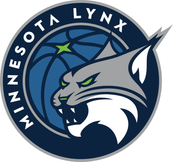
Minnesota Lynx unveil new logo

The Minnesota Lynx unveiled a new logo as part of a rebranding effort of teams owned by the Timberwolves and Lynx organization. The Lynx will continue using their current logo for the remainder of the 2017 season. Merchandise with the new logo will be available prior to the 2018 season.
“As we move back into Target Center next season, we wanted an identity that honors the achievements of the past while capturing the hopes and dreams of another generation of Lynx fans,” said Timberwolves and Lynx CEO Ethan Casson. “This new mark of the Minnesota Lynx reflects the fierce determination of our team and the barriers that have been broken in establishing ourselves as an elite organization locally and within the WNBA. New logo, new uniforms and a new home court will help celebrate our 20th season in our renovated home and lead us into the next 20.”
From a release about the logo:
While the logos are similar, all bearing the Nordic A and the North Star, the Lynx logo was created with elements all its own that are a nod to the team’s dominance in the WNBA. The Lynx head faces to the left, signifying a reflection of the team’s great past, with pride and mindfulness of its great future. The Lynx head is also the only one to break the seal of the circle, meant to portray the organization’s ability to fight fearlessly, break new grounds, pave the way for others and exert uncontainable energy.

